


Studio Bucky
Every Space Is a Portal to Wonder
Brand Identity
brand strategy
Design Direction
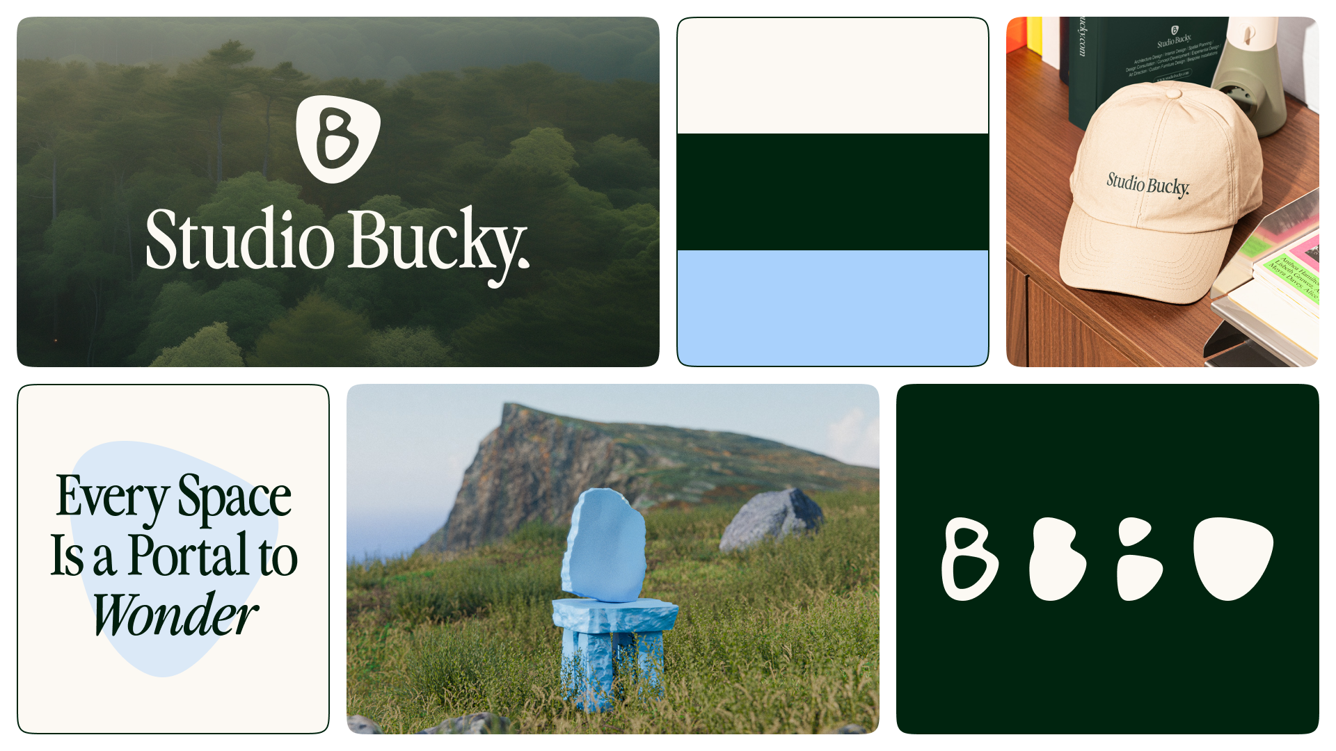
Studio Bucky is an architecture and interior design studio rooted in Irish heritage, drawing from the land, nature, and the harmony between built structures and their surroundings. Inspired by vernacular architecture and ancient landmarks worldwide, their vision translates into a design language that feels organic and human-centric.
But beyond aesthetics, Studio Bucky is an invitation — every space is a portal to Wonder. Like Alice’s rabbit hole to Wonderland, Studio Bucky designs spaces to transport, inspire, and spark curiosity.
This spirit of exploration shapes every design choice:
Logo: Inspired by vernacular architecture, designed as if built from standing stones, reflecting structures shaped by time and nature.
Brand Icons: Derived from the logo, abstracted into passageways that reinforce the idea of portals—invitations to step into new worlds.
Color Palette:
Blank Canvas (The Spark): represents new beginnings and imagination, the space where ideas are born.
Rooted Green (The Foundation): symbolizes nature and environment, grounding spaces in their natural context.
Blue Skies (The Journey): evokes curiosity and exploration, an invitation to expand beyond the familiar.
From its foundations in nature to its vision of immersive, transformative spaces, Studio Bucky is more than a studio—it’s a portal to Wonder, where every space becomes an invitation to explore the extraordinary.
For more information, reach out below!
Brand Overview

Inspiration Behind the Brand

Hidden Details

Design System


Brand Applications


Let’s Work Together!
Reach out below, and let’s make some magic happen 🪄✨